微信小程序开发之小程序组件label标签解读以及分析实例
label标签组件说明:
label标签,与html的label标签基本一样。label 元素不会向用户呈现任何特殊效果。不过,它为鼠标用户改进了可用性。如果您在 label 元素内点击文本,就会触发此控件。就是说,当用户选择该标签时,就会自动将焦点转到和标签绑定的表单控件上,主要用来改进表单组件的可用性。
使用for属性找到对应的id,或者将控件放在该标签下,当点击时,就会触发对应的控件。
for优先级高于内部控件,内部有多个控件的时候默认触发第一个控件。
目前可以绑定的控件有:<button/>, <checkbox/>, <radio/>, <switch/>
组件用法示例代码的效果如下:
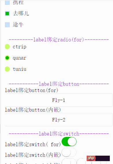
其中的WXML代码:
<view class="content">
<text class="section__title">-------label绑定checkbox(内嵌)-------</text>
<checkbox-group bindchange="checkboxChange">
<view class="label-1" wx:for="{{checkboxItems}}">
<label>
<checkbox hidden value="{{item.name}}" checked="{{item.checked}}"></checkbox>
<view class="label-1__icon">
<view class="label-1__icon-checked" style="opacity:{{item.checked ? 1: 0}}"></view>
</view>
<text class="label-1__text">{{item.value}}</text>
</label>
</view>
</checkbox-group>
</view>
<view class="content">
<text class="section__title">---------label绑定radio(for)---------</text>
<radio-group class="group" bindchange="radioChange">
<view class="label-2" wx:for="{{radioItems}}">
<radio id="{{item.name}}" hidden value="{{item.name}}" checked="{{item.checked}}"></radio>
<view class="label-2__icon">
<view class="label-2__icon-checked" style="opacity:{{item.checked ? 1: 0}}"></view>
</view>
<label class="label-2__text" for="{{item.name}}"><text>{{item.name}}</text></label>
</view>
</radio-group>
</view>
<view class="content">
<text class="section__title">-----------label绑定button-----------</text>
<label for="buttontest">label绑定button(for)</label>
<button id="buttontest" bindtap="testLabelBindButton_1">Fly-1</button>
<label>
<text>label绑定button(内嵌)</text>
<button bindtap="testLabelBindButton_2">Fly-2</button>
</label>
</view>
<view class="content">
<text class="section__title">-----------label绑定switch-----------</text>
<view>
<label for="switchtest">label绑定switch( for)</label>
<switch id="switchtest" checked/>
</view>
<view>
<label>
<text>label绑定switch(内嵌)</text>
<switch/>
</label>
</view>
<view>
<label>
<text>label绑定switch(内嵌)</text>
<switch/>
<switch/>
<switch/>
</label>
</view>
</view>
其中的JS代码如下:
|
Page({ data: { checkboxItems: [ {name: 'ctrip', value: '携程', checked: 'true'}, {name: 'qunar', value: '去哪儿'}, {name: 'tuniu', value: '途牛'} ], radioItems: [ {name: 'ctrip', value: '携程'}, {name: 'qunar', value: '去哪儿', checked: 'true'}, {name: 'tuniu', value: '途牛'} ], hidden: false }, checkboxChange: function(e) { var checked = e.detail.value var changed = {} for (var i = 0; i < this.data.checkboxItems.length; i ++) { if (checked.indexOf(this.data.checkboxItems[i][i].name) !== -1) { changed['checkboxItems['+i+'].checked'] = true } else { changed['checkboxItems['+i+'].checked'] = false } } this.setData(changed) }, radioChange: function(e) { var checked = e.detail.value var changed = {} for (var i = 0; i < this.data.radioItems.length; i ++) { if (checked.indexOf(this.data.radioItems.name) !== -1) { changed['radioItems['+i+'].checked'] = true } else { changed['radioItems['+i+'].checked'] = false } } this.setData(changed) }, testLabelBindButton_1:function(){ console.log("奔走相告,button通过for可以绑定成功啦!!!"); }, testLabelBindButton_2:function(){ console.log("奔走相告,button通过内嵌可以绑定成功啦!!!"); } }) |
其中的WXSS代码如下
|
.label-1, .label-2{ margin-bottom: 15px; } .label-1__text, .label-2__text { display: inline-block; vertical-align: middle; } .label-1__icon { position: relative; margin-right: 10px; display: inline-block; vertical-align: middle; width: 18px; height: 18px; background: #CAE1FF; } .label-1__icon-checked { position: absolute; top: 3px; left: 3px; width: 12px; height: 12px; background: #1aad19; } .label-2__icon { position: relative; display: inline-block; vertical-align: middle; margin-right: 10px; width: 18px; height: 18px; background: #CAFF70; border-radius: 50px; } .label-2__icon-checked { position: absolute; left: 3px; top: 3px; width: 12px; height: 12px; background: #1aad19; border-radius: 50%; } .section__title{ display: block; text-align: center; color: #9400D3; } .content{ padding-bottom: 15px; } |
主要属性:
|
属性 |
类型 |
类型 |
| for | String | 绑定控件的 id(该id和需要被绑定的表单控件的id一模一样才生效) |
以上就是微信小程序组件label标签解读和分析实例的详细内容。


