微信小程序实例教程:实现tabs选项卡效果
发布时间:2018-03-24 15:22 所属栏目:小程序开发教程
最近微信应用号是炒的如火如荼,热门满满,但是也可以发现搜索关键词出来,各类网站出现的还都是微信的官方文档解释。正好赶上这个热潮,这几天先把小程序技术文档看了个遍,就直接着手写案例了。很多组件微信内部已 ...
最近微信应用号是炒的如火如荼,热门满满,但是也可以发现搜索关键词出来,各类网站出现的还都是微信的官方文档解释。正好赶上这个热潮,这几天先把小程序技术文档看了个遍,就直接着手写案例了。很多组件微信内部已经封装完了,正好发现没有tab选项卡效果,这两天正好研究了下。思路如下:
1、首先点击导航的时候需要两个变量,一个存储当前点击样式类,一个是其它导航默认的样式类
2、选项卡内容列表同样也需要两个变量,一个存储当前显示块,一个存储的是其它隐藏的默认块
3、使用三目运算通过点击获取导航索引,根据索引判断是否添加当前类【备注,这里我将点击事件绑定在父级导航栏,通过target对象得到点击触发的事件对象属性】
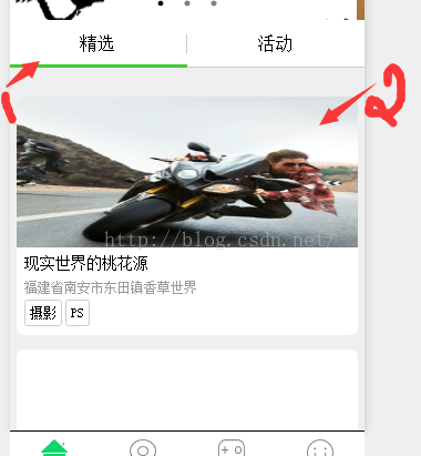
请结合如下效果图:
接下来直接查看源码:
demo.wxml:
- <view class="tab">
- <view class="tab-left" bindtap="tabFun">
- <view class="{{tabArr.curHdIndex=='0'? 'active' : ''}}" id="tab-hd01" data-id="0">tab-hd01</view>
- <view class="{{tabArr.curHdIndex=='1'? 'active' : ''}}" id="tab-hd02" data-id="1">tab-hd01</view>
- <view class="{{tabArr.curHdIndex=='2'? 'active' : ''}}" id="tab-hd03" data-id="2">tab-hd01</view>
- <view class="{{tabArr.curHdIndex=='3'? 'active' : ''}}" id="tab-hd04" data-id="3">tab-hd01</view>
- </view>
- <view class="tab-right">
- <view class="right-item {{tabArr.curBdIndex=='0'? 'active' : ''}}">tab-bd01</view>
- <view class="right-item {{tabArr.curBdIndex=='1'? 'active' : ''}}">tab-bd02</view>
- <view class="right-item {{tabArr.curBdIndex=='2'? 'active' : ''}}">tab-bd03</view>
- <view class="right-item {{tabArr.curBdIndex=='3'? 'active' : ''}}">tab-bd04</view>
- </view>
- </view>
demo.js:
- Page( {
- data: {
- tabArr: {
- curHdIndex: 0,
- curBdIndex: 0
- },
- },
- tabFun: function(e){
- //获取触发事件组件的dataset属性
- var _datasetId=e.target.dataset.id;
- console.log("----"+_datasetId+"----");
- var _obj={};
- _obj.curHdIndex=_datasetId;
- _obj.curBdIndex=_datasetId;
- this.setData({
- tabArr: _obj
- });
- },
- onLoad: function( options ) {
- alert( "------" );
- }
- });
demo.wxss:
- .tab{
- display: flex;
- flex-direction: row;
- }
- .tab-left{
- width: 200rpx;
- line-height: 160%;
- border-right: solid 1px gray;
- }
- .tab-left view{
- border-bottom: solid 1px red;
- }
- .tab-left .active{
- color: #f00;
- }
- .tab-right{
- line-height: 160%;
- }
- .tab-right .right-item{
- padding-left: 15rpx;
- display: none;
- }
- .tab-right .right-item.active{
- display: block;
- }
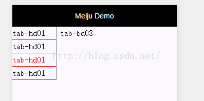
最终演示效果如下:

以上仅是个人方案,如果有更好的方案,欢迎提出~


