微信小程序组件化 快速实现可用模态窗
|
纵观现代前端框架中(不论ng react vue ) 基本四架马车 声明式渲染 路由 组件化 状态管理。 反观小程序开发环境 缺失蛮多特性的 好在 11月初微信团队,发布了官方的component 化方案, 我们基本上可以告别现有的hack办法去实现 component 化。 hack方式
使用template实现组件化
实现一个组件方便快速理解,下面使用官方组件化方案 实现一个模态弹窗 easyModal. 请结合源码看 https://gitee.com/sherlock221...
阅读前 请先读通官方自定义组件文档 组件分析
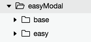
首先分成2个小组件 来实现这个模态弹窗 基本模态弹窗 具备
1.显示/隐藏 增强型模态弹窗 具备
1.基础模态弹窗功能 基本模态窗
首先在base文件夹下直接右键创建component -> baseModal
Component({

  options : {
    multipleSlots: true
  },
  /**
   * 组件的属性列表
   */
  properties: {

    backdrop: {
      type: Boolean,
      value: true
    },

    animated : {
      type: Boolean,
      value: true
    },

    modalSize : {
      type: String,
      value: "md"
    },

    animationOption : {
      type : Object,
      value  : {
        duration : 300
      }
    }

  },
}
下来创建 data,isShow控制 弹窗显示和隐藏 animation则是弹窗动画函数.
/**
   * 组件的初始数据
   */
  data: {
    isShow : false,
    animation : ''
  },
在生命周期函数 ready中初始化animation
ready: function () {
     this.animation = wx.createAnimation({
       duration: this.data.animationOption.duration,
      timingFunction: "linear",
      delay: 0
    });
  },
组件有2个public方法 show hide 方法, private 有执行动画 和 切换显隐的方法
methods: {
      hideModal : function(e){
        if(e){
          let type = e.currentTarget.dataset.type;
          if (type == 'mask' && !this.data.backdrop) {
            return;
          }
        }
        if (this.data.isShow) this._toggleModal();
      },

      showModal : function(){
        if (!this.data.isShow) {
          this._toggleModal();
        }
      },

      _toggleModal : function(){
        if(!this.data.animated){
            this.setData({
              isShow: !this.data.isShow
            })
        }
        else{
          let isShow = !this.data.isShow;
          this._executeAnimation(isShow);
        }


      },

      _executeAnimation: function (isShow) {
        ......
      }

  }
可以通过animated属性来判断 组件是否需要调用_executeAnimation 来执行动画显示 页面结构
<view  animation="{{animationData}}"  hidden="{{!isShow}}"  class='modal'>

     <view  data-type="mask"  catchtap='hideModal' class='modal-mask' >view>

      <view  class='modal-layer  modal-layer-radius {{modalSize == "sm" ? " modal-layer-sm" : " modal-layer-md" }} ' >


          <view class='modal-header'>
              <slot name="header">slot>
          view>


          <view class='modal-body'>
               <slot name="body">slot>
          view>

          <view class='modal-footer'>
               <slot name="footer">slot>
          view>
      view>
  view>
slot 节点,用于承载组件使用者提供的wxml结构。
options : {
    multipleSlots: true
  },
下来创建样式wxss
/** 模态 **/
.modal{
  position: fixed;
  top: 0rpx;
  left: 0rpx;
  right: 0rpx;
  bottom: 0rpx;
  width: 100%;
  height: 100%;
  z-index: 100;
}
..............
@import "../../style/font.wxss"; 这样会增加组件和业务的耦合度 公共组件不建议使用 接下来可以在业务界面中去使用
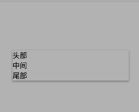
<base-modal id="thridModal">
  <view slot="header" class='modal-header'>
        头部
    view>
     <view slot="body" class='modal-body'>
        中间
    view>

    <view slot="footer" class='modal-footer'>
         尾部
    view>

base-modal>
别忘了在业务页面的json中引入组件
{
    "usingComponents": {
      "base-modal": "/component/easyModal/base/baseModal"
    }

}
还记得我们上面baseModal 有两个public方法 怎么样去调用呢 这里介绍下
我们给
onReady: function () {
    this.thridModal = this.selectComponent("#thridModal");
  },
然后就可以调用实例的public的方法. this.thridModal.showModal(); this.thridModal.hideModal(); 增强模态窗增强模态窗是基于baseModal的.
{
  "component": true,
  "usingComponents": {
    "base-modal" : "../base/baseModal"
  }
}
注意 增强模态窗口 需要包含 基本模态窗口 json中引用才能使用
<base-modal id="baseModal"   modalSize="{{modalSize}}"  animated="{{animated}}"  backdrop="{{backdrop}}">
    <view slot="header" class='modal-header'>
        <text>{{title}}text>
    view>

     <view slot="body" class='modal-body'>
        <slot>slot>
    view>

    <view slot="footer" class='modal-footer'>
         <text catchtap='_cancelModal' class='btn btn-default'>{{cancelText}}text>
         <text catchtap='_confirmModal'  class='btn btn-primary'>{{confirmText}}text>
    view>

base-modal>
说下event部分 确定 取消按钮是需要 向外部page 发送事件通知的其进行业务操作的
 //cancel
    _cancelModal : function(){
      this.hide();
      this.triggerEvent("cancelEvent");
    },

    //success
    _confirmModal : function(){
      this.triggerEvent("confirmEvent");
    }
通过triggerEvent触发事件 这点和官网文档没有区别. 业务Page界面:
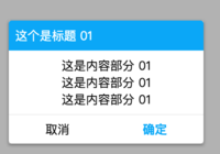
<easy-modal
      id="easyModal"
      title="这个是标题 01"
      bind:cancelEvent="_cancelEvent"
      bind:confirmEvent="_confirmEventFirst"
      >  <view class='modal-content'>
             <text> 这是内容部分 01 text>
             <text> 这是内容部分 01 text>
             <text> 这是内容部分 01 text>
|


