微信小程序--几个有趣的css3动画
微信小程序小教程--几个有趣的css3动画
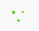
先看下效果:
除了有点快,动画效果还可以。
它是怎么实现的?
拿第一个双块舞动画研究一下好啦。
mxml:
css:
-
.sk-wandering-cubes .sk-cube { -
background-color: #67cf22; -
width: 10px; -
height: 10px; -
position: absolute; -
top: 0; -
left: 0; -
-webkit-animation: sk-wanderingCube 1.8s ease-in-out -1.8s infinite both; -
animation: sk-wanderingCube 1.8s ease-in-out -1.8s infinite both; -
} -
.sk-wandering-cubes .sk-cube2 { -
-webkit-animation-delay: -0.9s; -
animation-delay: -0.9s; -
} -
@-webkit-keyframes sk-wanderingCube { -
0% { -
-webkit-transform: rotate(0deg); -
transform: rotate(0deg); -
} -
25% { -
-webkit-transform: translateX(30px) rotate(-90deg) scale(0.5); -
transform: translateX(30px) rotate(-90deg) scale(0.5); -
} -
50% { -
/* Hack to make FF rotate in the right direction */ -
-webkit-transform: translateX(30px) translateY(30px) rotate(-179deg); -
transform: translateX(30px) translateY(30px) rotate(-179deg); -
} -
50.1% { -
-webkit-transform: translateX(30px) translateY(30px) rotate(-180deg); -
transform: translateX(30px) translateY(30px) rotate(-180deg); -
} -
75% { -
-webkit-transform: translateX(0) translateY(30px) rotate(-270deg) scale(0.5); -
transform: translateX(0) translateY(30px) rotate(-270deg) scale(0.5); -
} -
100% { -
-webkit-transform: rotate(-360deg); -
transform: rotate(-360deg); -
} -
}
是用css3动画样式实现的效果。sk-wanderingCube是自定义的动画名称,并非css3预定义的。
如果将两个方块,加到3个,如何?
添加一个sk-cube3,及其对应的新式?
-
-
.sk-wandering-cubes .sk-cube3 { -
-webkit-animation-delay: -0.45s; -
animation-delay: -0.45s; -
}
运行一下,不失所望:

(实际运行效果没有这么快,不知为什么用QQ截取动画后就变快了~)
如果把动画改慢一点,让三个方块,平均分布也是可以的,让其在空间上平均分布,即是让它们平均动画时间。
达到这样的效果,修改每桢间隔0.6s就可以了:
-
.sk-wandering-cubes .sk-cube { -
background-color: #67cf22; -
width: 10px; -
height: 10px; -
position: absolute; -
top: 0; -
left: 0; -
-webkit-animation: sk-wanderingCube 1.8s ease-in-out -1.8s infinite both; -
} -
.sk-wandering-cubes .sk-cube2 { -
-webkit-animation-delay: -0.6s; -
} -
.sk-wandering-cubes .sk-cube3 { -
-webkit-animation-delay: -1.2s; -
}
此外,animation-delay是标准名称,-webkit-animation-delay是safafi与chrome支持的名称,其它以-webkit-开头的css样式名是类似的。
如果只保留-webkit-*声明,如上所示。在微信web开发者工具上运行正常,因为它是基于chrome同样的内核渲染的css3样式。在android手机上也可以,亲测。在ios上没有测试,有兴趣的同学不妨测试下。
一般情况下,标准名称与webkit名称是同时定义的。
关于动画的说明
使用@keyframes规则,你可以创建动画。创建动画是通过逐步改变从一个CSS样式设定到另一个。
在动画过程中,您可以更改CSS样式的设定多次。指定的变化时发生时使用%,或关键字"from"和"to",这是和0%到100%相同。0%是开头动画,100%是当动画完成。
为了获得最佳的浏览器支持,您应该始终定义为0%和100%的选择器。
注意: 使用animation属性来控制动画的外观,还使用选择器绑定动画。.
绑定动画的语法有些复杂:
-
animation: name duration timing-function delay iteration-count direction fill-mode play-state;
值说明animation-name指定要绑定到选择器的关键帧的名称animation-duration动画指定需要多少秒或毫秒完成animation-timing-function设置动画将如何完成一个周期animation-delay设置动画在启动前的延迟间隔。animation-iteration-count定义动画的播放次数。animation-direction指定是否应该轮流反向播放动画。animation-fill-mode规定当动画不播放时(当动画完成时,或当动画有一个延迟未开始播放时),要应用到元素的样式。animation-play-state指定动画是否正在运行或已暂停。initial设置属性为其默认值。 阅读关于 initial的介绍。inherit从父元素继承属性。 阅读关于 initinherital的介绍。


